Thursday, August 30, 2012

Chinese Horseman

Wonderful Weaving re-visited:  this is one of the few cards I’ve done that I really like – fussy cutting and all . . .

 
 . . . there’s just something special about Asian-themed images that gives a stamper their best shot at a great layout.   Several years ago in one of Stampington’s Catch-Up issues, they wrote that Asian themes were by far the most popular, and then they promptly suited action to words by producing a Catch-Up issue devoted entirely to Oriental art.  It was a stunner for sure. 

The horse and rider were inked first with Peeled Paint, and then I took the Black Soot pad and just lightly dabbed around the edges.  I worried that I’d made a hash of it, but it actually turned out rather well.  The weaving on this card is almost as minimal as it gets:  three strips on the left and two on top.  Paper weaving can be one of the quickest, impressive-looking (but no-talent-needed) embellishments ever . . . give it a try!
 
Cardstock:         Bazzill Cantaloupe, Generic Oyster White, Washi papers ironed onto freezer paper
                              for added Strength       
Stamps:              Stamp Camp Texture Specks, Lost Coast Bamboo, Stamp Craft ‘Long         
                                Life’, MJ Barber Chinese Horseman                                        
Inks:                    Distress Old Paper, Peeled Paint, Black Soot, Ancient Page Mandarin
Doo Dads:          Dried pine needles, Chinese coin

Monday, August 27, 2012

Love

Brag Alert, Section 2!  The NJ State Fair is over again for another year and I am proud to announce that out of six submitted cards, I won four First prizes and one Second Prize – yay me!  Here I am holding a row of Blue and Red satin glory . . . no cash, just glory. 

 
 So now we’ll have a mini-series on the next several Mondays of four of my six winning cards.  You are welcome to pick them apart and see if you agree or disagree with the judges.  Similar versions of two of the cards have already been posted so we’ll put those aside as I don’t want to do anything that smacks of a repeat. 


 Today’s card won First Prize in the Holiday category.  In continuing with my Kraft kick for this year, the limited use of Valentines’ traditional red really stands out against Kraft.  This is also true of the diecut white doily whose thicker pattern makes a stronger statement than an actual doily does with its more delicate design.  Hard to find a color combo that doesn’t work with Kraft . . .

Cardstock:         Marcos Jute, Beckett Iceberg
Stamps:              VAL ‘Love’, Stampin’ Up Love Definition, La Jolla Holly Heart
Inks:                    ColorBox Chestnut Roan, Distress Brushed Corduroy, Hero Soft Brown, Ancient Page
                                 Cardinal
Emb Powder:    Vippie Transcendence
Dies/Punches:   Marvy Rectangular Scalloped punch, Papertrey Ink Doily, deckle-edged scissors
Impr Plate:        Cheery Lynn Cement
Doo Dads:          White-stitched red ribbon, White polka dotted brown grosgrain ribbon, White gel
                             pen

Thursday, August 23, 2012

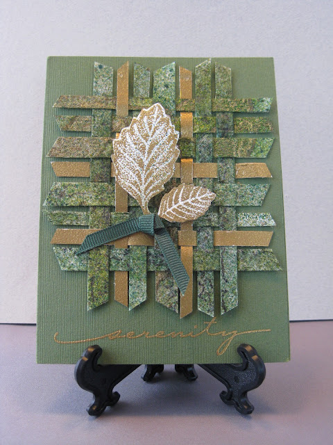
Serenity

Brag Alert, Section 1!  It’s been an interesting year in my stamping world so far and over the next four weeks, I’ll be sharing some gratifying results of my creative efforts.  The next three Thursdays will be given over to showing the cards currently featured in my first-ever published article – now appearing in the Fall issue of Rubber Stamp Madness.  Entitled “Wonderful Weaving”, I was delighted with their handling of it.  Moreover, the photography makes my cards look better than they do in real life!

 
Paper weaving offers stunning results for minimal time and effort.  One tip is to save scraps from previous projects and cut them into 1/4” to 3/8” strips with your trimmer before stashing them.  Anything 5” or longer is perfect, and don’t get crazed about perfect cutting:  various widths and irregularities are what make this art form work.  Weaving takes mere minutes and can be done with as few as three or even two strips on a side (see next Thursday’s post for an example of this) . . .

Cardstock:         Bazzill Rain Forest, various scraps from previous projects: many sprayed with color    
                           washes and embossed with either Gold or Black images
Stamps:              Purple Daisy Birch Leaf, Hero Serenity
Inks:                    ColorBox Gold, various light and dark Green color wash sprays
Emb Powder:    B’Muse Detail Fine Gold
Punches:            Punch Bunch Birch Leaf
Doo Dads:          ¼“ Green grosgrain ribbon

Monday, August 20, 2012

To Comfort You

When I first started stamping, I decided that I wouldn’t make Sympathy cards.  It just seemed sort of a borderline-showy thing to do at a time when all of the emphasis should be on the bereaved.  But I came to change my mind . . .


 . . . it happened when a member of my church died – a gentleman who was dearly loved by all of us.

I found that making a card was the most natural thing for me to be doing:  there was nothing I could do to change the unhappy circumstances, but what I could do was show his wife how much I cared by putting my heart and my hands to this creative task.  Her reaction revealed that I had made the right decision and it turned out to be good for both of us.  

My policy is to never sign the back of my Sympathy cards and I keep the design quite simple.  When the losses are closer and more personal, it’s always a little surprising to realize how much I am comforted in the doing of this.

Cardstock:         Bazzill Leapfrog, Pear; Beckett Candlelight, Generic Dull Gold
Stamps:              Stampin’ Up sentiment
Inks:                    ColorBox Black, Encore Honeydew, Pilot Gold Marker
Emb Powder:     B’Muse Ebony
Emb Folder:       Crafts-Too Leafy Tree
Punches:            Family Treasures Scalloped Ovals, Fiskars Interlaced Corner Adorner


Thursday, August 16, 2012

SCARY!

Out of all the years I’ve done Halloween cards, this one is still my favorite.  Hard to lose when the Master of Hilarious Macabre – Edward Gorey – is on the scene . . .


 . . . Gorey’s Running Man perfectly illustrates the way most of us would feel when passing a cemetery on a dark and spooky night.  Not that we would ever find ourselves there at such a time!  It took a little time to fussy-cut my frightened subject:  usually I think it actually looks better to leave a little margin around cut-out elements, but in this case, I decided my guy would look better without any white edges showing.  So it was worth the effort, which was greatly aided by outlining him with a black marker after I’d finished cutting – this covered up any errant glimpses of white.  And no, it’s not too early to be thinking about Halloween!

Cardstock:     Generic Black Linen, Beckett Moonlight,
Stamps:          Sideshow Graveyard, Gorey’s Running Man, Vippie “Scary”, Amuse
                               Hanging Ghost
Inks:                Archival Black, Marvy Plum marker, Gelly Roll Silver pen,
Colored Pencils: Prisma Nectar, Framboise, Black, Sandbar Brown, Sienna Brown
Dec. Scissors: Fiskars Deckled in two sizes

Monday, August 13, 2012

Two Years Old!

Since this one was for a two-year old, I thought he wouldn’t mind if I made an experimental foray into the world of scenic stamping.  WHOA!  How grateful I am that the artistic discernment of a two year old is pretty much non-existent.  Just this one timid little step into semi-scenic stamping is all I care to make, thank you very much . . .


I now have even more respect for scenic stampers and I will be entirely happy to leave this tricky art form entirely to them.  My one bright idea in this card was turning the graphic leaf stamps into trees:  surely my profs from the wonderful online Stretch Your Stamps class of last month would be proud!

Cardstock:         Generic textured Dark Teal, Beckett Iceberg
Stamps:              Hero Clouds, Memory Keepers Leaves (used as trees) from Autumn 
                             Splendor Set, Impress Ground, Close To My Heart Airplane from Summer Set
Inks:                    ColorBox Moss Green, Hunter Green, Silver, Ancient Page Agean Blue,
                              Pine, Marvy Embossing Ink Brown
Emb Powder:    Vippie’s Transcendence, B’Muse Silver
Dies/Punches:   Fiskars Clouds, DieNamics Mini Pennants, Memory Keepers ¼“ corner
                             rounder


Thursday, August 9, 2012

It's Your Day!


While fixing my husband’s breakfast yesterday morning, I all of a sudden realized I had the makings of a great color scheme right in front of me:  Cream (the bowl), Kraft (the flax flakes), Light Green (the Casaba melon), and Deep Blue (the blueberries).  Nothing would do but to head on downstairs to my Laughin’ Place and start creating . . .


 Inspiration is everywhere, folks – all we have to do is open our eyes and see it!  This is also known in some circles as ‘paying attention’.  Meanwhile, although my card was inspired by my husband’s breakfast cereal, please refrain from pouring any milk and sugar over this . . .

Cardstock:          Beckett Moonlight, Bazzill Sprout, Light Chocolate,
                                 Admiral, Generic Taupe  
Stamps:               Text:  Stampin’ Up;  the hexagon inserts were die cut
                                  from numerous scraps in my Background Box and   
                                  their origins far precede anything my faulty memory   
                                  can possibly dredge up.
Inks:                      Likewise, a little bit of everything, plus Ancient Page
                            Cobalt for the text
Emb Powder:     Vippie’s Transcendence
Dies/Punches:   Papertrey Ink Hexagon Die, Marianne Flower #192
Doo Dads:           Taupe eyelash fiber

Monday, August 6, 2012

Flower Resist

Resist techniques are surging in popularity more than ever before and well they should be.  The methods are easy and fun to do, the results are always beautiful, and since you never know exactly what you’re going to get, the element of surprise can be factored in as well.


Resist is usually done by stamping and embossing an image before the colors are sponged on.  The raised embossing resists dye inks which are toweled off the embossed surfaces after they’ve been sponged/swirled on.  Wondrous results are practically guaranteed and even beginners will have great success! 

For softer and more muted effects, stamp and emboss first, then swirl on the inks afterwards.  For more contrast and sharper definition, do only some of your images first, as just described.  Then add the direct-to-paper coloring overall, and allow to dry.  Lastly, over-stamp and emboss another one or two of your images.  Technically speaking, these last additions are no longer considered to be authentic Resist, but we’re not going to pick nits here.

However, even at this point, further color can be sponged on as desired.  Also, non-embossed images can be added at this time using one or two of your main colors, as I did with the stamped blue flower upper left.  This will add depth, interest, and is useful for filling in areas that need a little extra “something”.  For this card, the white flower upper right was done after I had worked on the rest of the card – it is a slightly crisper white that the camera probably won’t pick up.  The other two white flowers were stamped and embossed before the coloring was sponged on – a very faint amount of that color was retained which softens the results slightly.  Tweaking Resist this way adds slightly more dimension, which in my book, is the name of the game!

Cardstock:         Beckett Iceberg, Generic textured Navy Blue
Stamps:              Rubber Stampede Periwinkle Blossom
Inks:                     ColorBox Frost White, Vivid Sky Blue, Turquoise, Lavender
Emb Powder:   Judikins Opaque White
Dies/Punches:  EK Success corner punch, flower punches, JustRite
                                   Charms Die
Doo Dads:          Lilac ribbon, crystals, Gelly Roll Pen Clear Star

Thursday, August 2, 2012

Thanks

If I can keep the card design simple and not get carried away with artistic flights of fancy along with multiple die cuts, I can usually get my thank you notes done and mailed in timely fashion . . .


 . . . as usual, texture is King and this wonderful element can always be counted upon to add lots of interest to a card that might otherwise come off as a little flat.  This card easily takes only ten minutes to come together, thus leaving me more time to write a decent thank you note that says something a little more than, “Gee, thanks” on the inside.  Sometimes, it’s all about priorities, isn’t it?

Cardstock:         Generic textured Cordovan, Chocolate Brown
Stamps:              Great Impressions Thanks
Inks:                    ColorBox Frost White, Marvy Marker Silver,            
                           Gelly Roll Pen Silver
Emb Powder:    Judikins Opaque White
Dies/Punches:   Marvy Giga Scalloped Circle, EK Success Flower Trio
Doo Dads:          1½” White ribbon, Silver brads