Monday, October 30, 2017

Trick or Treat

My long overdue love affair with Tim's Crazy Birds may have gotten off to a late start, but oh boy, am I ever making up for lost time . . .


The set of Crazy Things (stamps and matching dies) makes it so much fun to play with these wonderful birds.  Kristina Werner designed these accessories and she covered all of the major holidays with various motifs:  in this case, a pumpkin, broom, and witch's hat.  Along with a large variety of useful images including hats, glasses, and balloons, this means you make these birds work for just about any event you can name! 

This is really the most versatile collection I've ever owned . . .

Cardstock:   Bazzill Blueberry, Strathmore #100 Bristol, Kid’s Series
                           Paint Pad   
Stamps:        Tim Holtz Bird Crazy, Crazy Things, Crazy Talk
Inks:               Distress Carved Pumpkin, Dusty Concord, Shaded Lilac,
                           Black Soot, ColorBox Black
Emb Powder:   Distress Black Soot
Dies:              Tim Holtz Bird Crazy, Crazy Things, Spellbinders A2
                           Distressed Edges
Doo Dads:    Glossy Accents        

Thursday, October 26, 2017

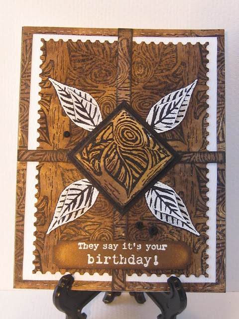
It's Your Birthday!

The coloring on this card was inspired by a beautiful $96 men's shirt I saw in a catalog.  At that price, I will never be gifting my darling hubby with it, even though he deserves it - and much more . . .


The fun thing for me on this card was the three black embellishment dots.  I used Ranger's Enamel Accents which I love because they form perfect little shiny domes easily.  However, for this card, shiny wasn't what I was after.  So while the glue was still wet, I sprinkled on some black embossing powder and tipped off the excess.  No heat gun, of course - that would have just made everything shiny again.

I will forever be grateful to the blogger who suggested using embossing powder over glues and tapes but not  heating it in order to achieve matte finish results.  SCORE!

Cardstock:   Strathmore Bright White, Soft White, Generic scraps Black    
Stamps:        Peddler’s Pack Swirly Roses & Leaves, Swirly Rose Leaf,
                           Wild Rose Leaf, Stampin’ Up “They say it’s your 
                            birthday”           
Inks:               Distress Walnut Stain, Brushed Corduroy, Hero Black,
                           ColorBox Frost White
Emb Powder:   Distress Black Soot, WOW White Puff, Sweet Stamps
                                Fine Detail White  
Dies:              Mama Elephant Peek a Frame                
Doo Dads:    Inkssentials Enamel Accents Black, covered with 
                          Black Soot EP     


Monday, October 23, 2017

Same Direction

This anniversary card features a favorite quote that I usually use on wedding cards . . .


 . . . but it's also perfect  to give to a couple looking back on several decades of a very loving and successful marriage.

I used dark green along with a fresh Spring green on the reverse die cut leaves.  This was meant to suggest both old growth and new.  As all really great marriages involve plenty of each, I thought it would be fun to imply that in the artwork.  Then again, the two shades of green look pretty together and perhaps that's enough . . .

Cardstock:   Bazzill Rain Forest, Parakeet, Beckett Candlelight       
Stamps:        Stampin’ Up Itty Bitty Backgrounds, Impression
                           Obsession Same Direction, Sweet ‘n Sassy
                           Decorative Frame Toppers           
Inks:               Distress Mowed lawn, Peeled Paint, Ancient Page Pine,
                           Hero Black, Gelly Roll Clear Star                       
Emb Powder:   Vippies Transcendence  
Dies:              Frantic Stamper Reverse Cut Leaves, Gina Marie
                           Stitched Rounded Squares, Marianne Butterflies                 
Emb Folder: Spellbinders Blistered                    
Doo Dads:    Karen Foster Loopy Brad              


Thursday, October 19, 2017

Harvest a Blossom

The background on this one came out of my beloved scrapbox, and the colors of brown, black, and white dictated those I used on the bouquet . . .


Inking an image in multiple colors by using standard-sized ink pads used to be difficult - that is until Tim Holtz led the way with his wonderful Mini Ink Pads.  They've made this multiple-coloring technique so much easier to do!

Cardstock:   The Paper Cut Brown Umber, Strathmore #90
                           Watercolor paper      
Stamps:        Hero  Zig Zag Pattern, Local King Thankful Flowers,
                           Red Rubber “Harvest a blossom of love”
Inks:               Distress Black Soot, Walnut Stain, Brushed Corduroy,
                           Ground Espresso, Tea Die
Emb Powder:   BMuse Eggshell White 
Dies:              Local King Thankful Flowers, Spellbinders A2 Distressed
                           Edges, Avery Elle Wonky Stitches, Papertrey Ink
                           Sketched Shapes
Doo Dads:    May Arts Jute, Perfect Pearls Mist Burnished Bronze, 
                            Oriental Trading pearls Bronze, Wink of Stella Gold                    

Monday, October 16, 2017

Dude

There was a happy smile on my face the entire time I worked on this card . . .


I've had the Bird Crazy set of stamps, dies, and accessories for as long as they've been available, yet this is the first time I've put any of them to use.  I'm a little odd that way.  I buy only what I absolutely love, and then when it arrives, I usually file it away.  Weird. But the day always comes when I rummage through my stash and something like the Bird Crazy collection leaps out at me and I am compelled to put it to work.

This card was the most fun to put together that I've had in a long time - and I always have fun stamping!  There were some really clever minds at work when this collection was designed:  from the stamps to the dies, no detail was overlooked and it was a pleasure every step of the way.  No, I'm not getting paid to flog this set:  I just loved working with it!

Cardstock:   Bazzill Cocoa, Strathmore Ultimate White         
Stamps:        Tim Holtz Bird Crazy, Crazy Things, Hero Designer
                           Woodgrain        
Inks:               Hero Black, VersaMark, Distress Vintage Photo                       
Watercolors:   Inktense Pencils Dark Aquamarine, Sicilian Yellow, Willow,
                              Hooker’s Green, Zig Clean Color Haze Blue, Yellow,
                              Oatmeal, Green
Emb Powder:   WOW Clear Matte Dull  
Dies:              Tim Holtz Bird Crazy, Crazy Things, DieVersions font
                           Noodles: “Dude”, Goodculler Stitched Rectangles, DieNamics 
                           Horizontal Stitched Strips                    

Thursday, October 12, 2017

Eat Your Veggies

We've reached the end of the tie die collection of backgrounds.  Well, for now, anyway . . .


Orange Gelatos were used on the carrots and I made a happy discovery while using them . . . always a good thing.  While stroking the Gelato onto the stamp, I had thought the resulting impression would be smooth and I would have to doctor it up to give it a more realistic look.  Not so:  two gentle spritzes from my mister gave the carrots the wonderful texture I was hoping for.

Time to dig into my Gelatos box and have me some more fun like this!

Cardstock:   Bazzill Parakeet, Coffee Filter White       
Stamps:        A Stamp in the Hand Veggie Set , Words Background
                           Script, Stampin’ Up Itty Bitty Backgrounds:  Dots
Inks:               Ancient Page Reinkers Pine, Sage, Mandarin
Colorants:    Gelatos Mango
Emb Powder:   Vippies Transcendence  
Dies:              Goodculler Stitched Rectangles, Marianne Butterflies 
Doo Dads:    American Crafts Jute Green                      

Monday, October 9, 2017

Celebrate

I'm a little on the fence with this one . . .


The individual elements have their appeal, but I'm not so sure that the assemblage really works.  What I do like is the success of an idea I read about on a blog only a few days ago.  I wish I'd written down the blogger's name so that I could give her proper credit.

Here's what I learned:  As a texture freak, I'm always looking for ways to add it to my layout.  Also, I love heat embossing but I don't always want the shiny results.  The blogger's idea was to use embossing powder to add color and texture, but don't heat it!
The result is a matte finish texture that adds color and dimension without the shine.

I tried it in a very small way on this layout so I could see if it worked.  Check out the first and third leaves.  To adhere the powder, I put scotch tape on the back and poured the embossing powder over them.  I pressed down to firmly seat the powder, tapped off the excess, used a gentle brush to remove the stray bits and returned them to the jar.  The results were exactly what I hoped for!  I'm going to try this idea on larger areas the next time and will also see if using my favorite matte glue - Elmer's School Glue - would be a good idea.  I'll keep you posted!

Cardstock:   Bazzill Admiral, Strathmore #90 Watercolor paper,
                           Neenah Desert Storm  
Stamps:        Hero Swirly Dot Border, Printworks “Celebrate”
Inks:               Ancient Page Reinkers Lapis, Plum, Sandalwood,
                           Cobalt, ColorBox Cream White, VersaMark    
Emb Powder:   Distress Antique Linen, Vippies Transcendence,
                            PSX Cobalt Tapestry, Ranger Antiquities Claret  
Dies:              DieNamics Stitched Mini Scallop Rectangle, Goodculler
                           Stitched Rectangles, Lil Inkers Stitched Mats: Dual
                           Stitched Squares, Arich Rounded Corners Stitched
                           Rectangles, Sue Wilson Faux Quilled Leaves          
Doo Dads:    Oriental Trading Pearls, inked with VersaMark and 
                           heat-embossed with Antiquities Claret                        

Thursday, October 5, 2017

Special Thoughts

I'm nearing the end of the tie die backgrounds, I promise . . .


Because coffee filters are not really designed for stamping, ink will sometimes diffuse a bit.  This can be a good thing if you want a slightly softer effect.  Once the main colors were sponged on and dried, I over-stamped with a text image in Sandalwood.  It came out with a misty look to it which I like.   Since the rest of the background was so enthusiastically colorful, I decided to keep the focal points rather simple.  Soft colors and minimal texture seemed to do the job . . .

Cardstock:   Bazzill Fawn, Coffee Filter White 
Stamps:        Tin Can Mail Italian Background Script, Printworks
                           “Special Thoughts”
Inks:               Ancient Page Reinkers Redwood, Lapis, Sandalwood,
                           ColorBox Frost White
Emb Powder:   Sweet Stamps Fine Detail White  
Dies:              Wplus9 Anastasia Tag, NCraft Leaves                 
Doo Dads:    Bonnie’s Best Corners Antique Copper, Liquid Pearls
                           White Opal, Viva Pearl Pen Ice White                        

Monday, October 2, 2017

Play, Explore, Persevere

After several weeks of brilliant color, I thought a little restful grey might be in order . . .


When my husband's birthday rolls around, the theme is always chess.  He's a demon player, rated, and regardless of his mild dementia, he nearly always wins.  Thank God he's still able to experience great joy in playing his beloved chess games!  Cards with this theme never fail to bring a big smile to his face, so that's almost as much fun for me as the time I enjoy when making his cards.

Cardstock:   Staples #110 Gray, Strathmore Soft White, Generic
                           Matte Silver
Stamps:        Stamp Camp Distressed Checkerboard, Art Impressions
                           Chess King, Starving Artistamps Positive Words: “Play”,
                           “Explore”, “Persevere”
Inks:               Hero Black
Dies:              Memory Box Stitched Rectangle Trimmings, Lil Inkers Top
                           Dog Photo Props, Spellbinders On the Edge
Doo Dads:    Distress Stickles Brushed Pewter