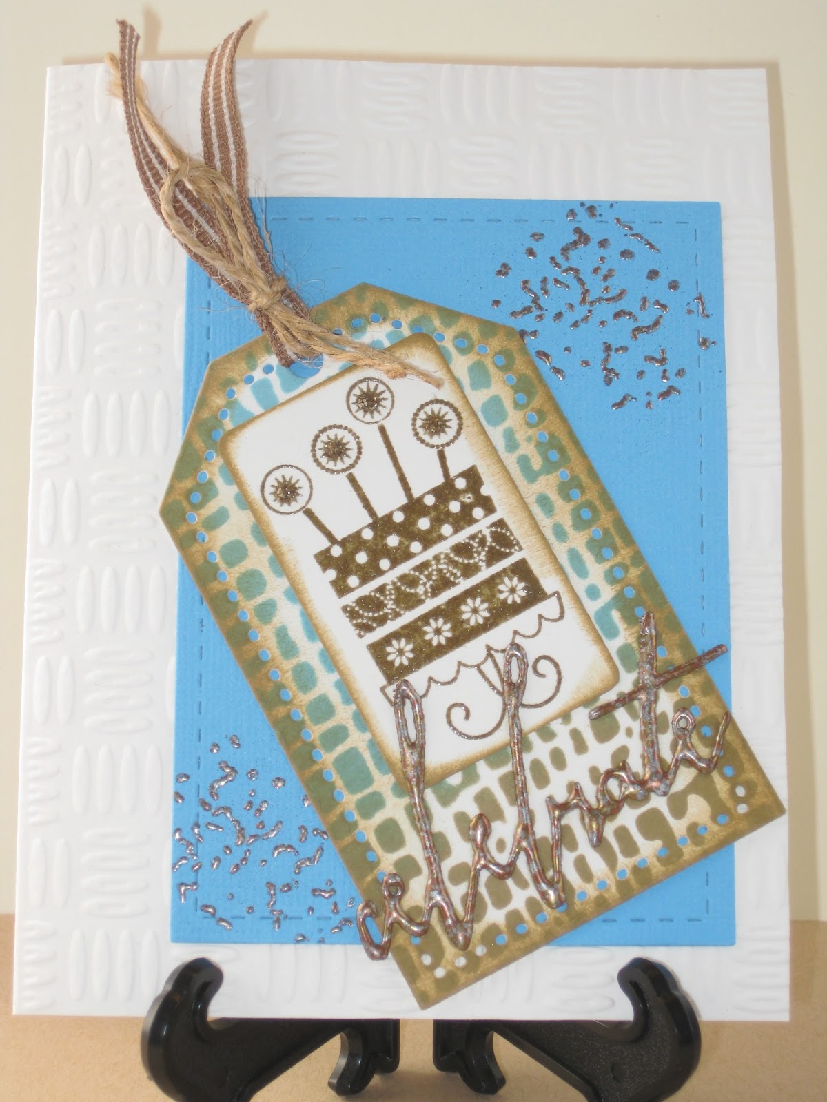
Thursday, October 29, 2015

Trick or Treat!

I could happily make Halloween cards all year long . . .


It's so much fun to play with strong colors, wonderfully graphic images, bizarre scenarios, and no end of really cheeky comments.  To say nothing of enjoying a truly legal chocolate rush!

Cardstock:   Bazzill Cutie, Raven, Champion Snow Day, The Paper
                           Cut White Matte Coate
Stamps:        Tim Holtz Trick or Treat- Spider Webs, Picture Show
                           Haunted House, Vippies “Smell My Feet”
Inks:               Hero Black, ColorBox Frost White, Distress Markers
                           Mustard Seed, Spiced Marmalade
Emb Powder:   Stamp Zia White, Black Sparkle
Dies:              Spellbinders Deckled Rectangles, Simon Says Talk Bubbles

Monday, October 26, 2015

Happy Birthday

After laying down bands of color with Inktense pencils, I stenciled over them with transparent texture paste.  When the paste dried, I trimmed the piece into a strip and then decided the colors needed a little more pop.  So I went to work with Distress Stains dabbed over the colors . . .


 . . . much better!  The underlying colored pencils made the Stains more intense and the colors now look jewel-like – I'm very happy with how they work with the black and white.

This is my first use of Transparent Matte Texture Paste and I like its frosted look.  But I'm still on the lookout for a truly clear, non-shiny matte finish stenciling paste.  It's doubtful as to whether or not such a product has even been invented yet, but hope springs eternal and I shall continue to lie in wait, ready to pounce . . .

Cardstock:   The Paper Cut Watercolor paper, Champion Snow
Stamps:        Lawn Fawn Interlocking Backdrops, Stampendous
                           “Happy Birthday”
Inks:               Distress Stains Barn Door, Rusty Hinge, Mustard Seed,
                           Mowed Lawn, Salty Ocean, Dusty Concord, ColorBox
                           Frost White
Emb Powder:   Judikins Opaque White
Dies:              Tim Holtz Labels
Watercolor Pencils:   Derwent Inktense pencils     
Stencil:          Dylusions Blocks, small
Doo Dads:    Ranger Transparent Matte Texture Paste, Black and
                           Clear crystals


Thursday, October 22, 2015

Awesome Day

There are two cards on this post so be sure to scroll down.  I broke out my colored die powders – in this case, Bisters – and had more of the fun I always have with these.  The first card features Parson's "Egyptian Fans" image.  The results pleased me so much that I was late in sending it out!  I was having way too much fun gazing at it repeatedly and the time just slipped by without my noticing . . .


I used the same materials for the second card, but changed out the image.  For both cards, I cut the watercolor cardstock to size and stamped and embossed the images first.  Then I brushed water onto the paper and immediately dusted on the dye powders.  I re-misted and moved color around where needed with my finger and then heat dried.  A little Wink of Stella for sparkle among the fans and the leaves and . . . done! 


 I'll never tire of these wonderful powders!

Cardstock:   Bazzill Jade, Strathmore #90 Watercolor paper
Stamps:        Parsons Egyptian Fans, Judikins Bismark Palm, Simon
                           Says Tilted Banner Sayings: “Hope your day is awesome”,
                           Starving Artistamps Mini Positive Words: “Explore, Discover,
                           Nurture”
Inks:               ColorBox Black, Bister powders Natural, Green
Emb Powder:   Judikins Detail Black
Markers:        Copic E84 Khaki
Dies:              Lil Inkers Stitched Mats Rectangles, Simon Says
                           Tilted Banners
Doo Dads:    Wink of Stella Clear


Monday, October 19, 2015

Happy

I've been enchanted with several card-making design choices that have been very popular lately:  the color grey, striped borders, text backgrounds, gesso, and die cut words.  I sorta went crazy and used them all on this card . . .


 . . . and on this variation . . .


I like to stack die cuts for more dimension, but gluing the layers together can get messy, especially when using skinny words and letters.  Also, I often have trouble lining up images accurately.  My solution is to run a layer of cardstock through my Xyron and adhere it to a second layer.  Then I die cut:  that gives me two well-adhered layers right off the bat, and if I wish to double those up, the gluing is easier to do with the sturdier die cuts.  Even the wafer thin dies will cut easily through doubled cardstock, especially when a metal adapter plate is used.  A real time-saver and a lot less mess!

Cardstock:   Bazzill Rock Candy, Generic Light Grey, Strathmore
                           #90 watercolor paper
Stamps:        Hampton Art Willowy Sunflower (first card), or East Coast
                           Daisy (second card), Hero Friends Definition, Impression
                           Obsession Thin Stripes
Inks:               ColorBox Orange, Frost White, Hero Black, Copic
                           Toner Gray T1
Emb Powder:   Judikins Opaque White, B’Muse Metallic Marmalade
Dies:              Tim Holtz Handwritten Celebrate: “Happy” (first card) or
                           Tattered Lace Everyday Sentiments: “Happy Birthday”
Colored Pencils:   Prisma Orange, Spanish Orange, Olive Green,
                                    Limeade, Black Raspberry
Doo Dads:    Faber Castell Gesso, Gamsol, Viva Pearl Pen Ice White

Thursday, October 15, 2015

It's In the Snail!

I have two trays of postoids, all of which I love, but I never seem to find a way to work them into my layouts . . .


Maybe I've begun to turn a corner here?

Cardstock:   The Paper Cut Eames White, Strathmore #90 Watercolor
                           paper, Bazzill Classic Yellow
Stamps:        Hero Manuscript Background, Postoids are by Hero Arts,
                            Limited Edition, and Stamp Francisco, Unknown “It’s
                           in the snail”, Endless Creations “Another year older . . .”
Inks:               VersaCraft Lemon Yellow, Ancient Page Cardinal,
                           Lindy’s Stamp Gang Magicals Mango Mania, Hibiscus Rose
Emb Powder:   Vippies Transcendence, Stampendous Shabby White
Dies:              Lil Inkers Stitched Mats Rectangles, Tim Holtz Labels, 
                          Spellbinders Lacy Squares

Monday, October 12, 2015

Cheers!

As Stamper Extraordinaire Laura Bassen calls it, "Smooshing" remains one of my favorite ways to create a background.  It's easy, fun, and exciting because you never really know what you're going to get!  Watch out for complimentary colors as you'll risk getting a muddy look – other than that simple caveat, terrific results are practically guaranteed . . .


Go light and cover just a part of your background with this watercolored look, or go extreme as I did and cover the entire background, or color any amount in between:  your choice.  You can Google "Laura Bassen smooshing" and get several instructional samples to look at . . . here's one of them, complete with video.

For this card above, I white-embossed the background image before smooshing with two shades of brown.  The hanging grapes image was stamped and embossed in brown and watercolored with Peerless watercolors.
 
Cardstock:   Strathmore #90 Watercolor paper
Stamps:        Rubber Stampede Stained Glass Grapes, Stamp Zia Cheers!
Inks:               ColorBox Frost White, Distress Walnut Stain, Brushed Corduroy
Emb Powder:  Judikins Opaque White, Vippies Transcendence
Dies:              Spellbinders Small Deckled Rectangles
Watercolors:     Peerless Ecru, Burnt Umber, Olive Green, Heliotrope, 
                                Warm Sepia
Doo Dads:    Viva Pearl Pen Cream, Perfect Pearls Mist Gold


Thursday, October 8, 2015

Celebrate

I made a series of guy cards and experimented with both white and tan cardstocks which I have pictured here.  I wanted a masculine textured background for the card front, and while I love a really deep embossed impression, this is sometimes rough on the cardstock and can weaken it so much that it tears . . .


Tim Holtz offered one excellent way around this:  place a piece of his Grunge Paper (not Grunge Board) in the embossing folder along with your cardstock.  You'll still get a deep impression but without savaging the cardstock. 

I discovered another happy solution with this card:  I embossed my much-loved #90 watercolor paper!  It took the pattern beautifully and there was no damage or thin spots to be found.  If ivory-colored cardstock works for your design, you might wish to try this!

The wonderful word across the bottom is "Celebrate" and is perfectly legible IRL but not so much as far as the camera is concerned . . .

Cardstock (card base):     Strathmore Ivory OR Strathmore #90 Watercolor paper OR Neenah Desert Storm, OR Marcos Jute
Cardstock (colored layer): Bazzill Ocean, Kachina, Jacaranda, Generic Textured Teal, Sky Blue;  Chipboard/Jacaranda
Stamps:        Hampton Art Sparkling Birthday Cake, CC Rubber Stamps
                           Fibers
Inks:               Distress Tumbled Glass, Broken China, Brushed Corduroy,
                           Frayed Burlap, VersaMark
Emb Powder:   Vippies Transcendence, Bear Rubber Melded Metallic
Dies:              Papertrey Ink Tag Sale #3, Lil Inkers Stitched Mats:
                           Rectangles, Spellbinders Rectangles Two, Tim Holtz
                           Handwritten “Celebrate”
Emb Folder: Die-sire Embossalicious Gun Metal
Stencil:          Tim Holtz Burlap
Doo Dads:    Jute fibers, ¼" ribbon


Monday, October 5, 2015

Beloved, Treasure, Forever

This is the card I gave my husband on our 22nd anniversary earlier this year . . .


Along with the small flowers on the right, I'd planned to keep the background white.  But the flowers were lost in too much white and needed a bit of contrast to set them off.  So I picked the lightest shade of gray I had in my Copic marker stash, colored in most of the background, and with a little shading to make the white flowers look fresh, I got the subtle results I was after.  Yay!
 
Cardstock:   Bazzill Pauly Poo, The Paper Cut Watercolor paper
Stamps:        Dreams Come True Sketched Floral, Starving Artistamps
                           Mini Positive Words: Forever, Treasure, Beloved”
Inks:               ColorBox Black
Emb Powder:   Judikins Detail Black
Dies:              Lil Inkers Stitched Mats: Rectangles
Watercolors:     Peerless Forget Me Not Blue, Cobalt Blue, Marigold Yellow,  
                                Chrome Orange, Hunter’s Green, Amethyst
Markers:        Copic E40 Brick White
Doo Dads:    Gelly Roll Clear Star
MSG:  Studio G “Happily ever after” White emb


Thursday, October 1, 2015

Unique

And here is the final posting in this series . . .

Blue Ribbon Winner #9:
A mix of texture and pattern was on the menu here . . . 


 As this is a very country-style State Fair, an image of a chicken and its namesake chicken wire ought to fit right in.  And with a color scheme of Kraft, red and black, I thought this layout might be a winner.  Evidently, the judges agreed . . .

And thus endeth my 7th annual romp through the Home & Hobby competition at our local State Fair.  Winning nine blue ribbons for nine submitted cards is admittedly over the top, but I'll take it – it was a fun ride and I'm already looking forward to next year!  But I think I'll do seven cards instead of nine;  that ought to be enough, don't you think?

Cardstock:   Neenah Desert Storm, Wausau Firecracker Red
Stamps:        Picture Show Chicken & Wire, Frog’s Whiskers Straight
                           & Narrow, Hero Designer Woodgrain, Appaloosa “Unique”
Inks:               Brilliance Rocket Red, Hero Black, Distress Black Soot,
                           Brushed Corduroy
Dies:              Marianne Decorative Tags
Colored Pencils:  Prisma White, Orange
Emb Folder: Cuttlebug Honeycomb      
Impr Plate:    Cheery Lynn Cheesecloth
Doo Dads:    Tiny Flower punch