Thursday, January 28, 2016

Blessings

This one had me stumped for awhile!  I started out with strong colors on a large piece of watercolor paper.  Then I stenciled on clear paste and sprinkled with glitter.  It was gorgeous, and would have looked marvelous on the side of a building, but it was way too overwhelming for a mere card front . . .


Cutting it down to size was the solution.  It also occurred to me to layer it onto a textured background and then top it with a die cut tree.  Although the camera has ignored it, the glitter shimmers through the tree and I'm happy with the results . . . hope you like it too!

Cardstock:   Bazzill Crimson, Strathmore #90 Watercolor paper, Generic
                           Gold Metallic
Stamps:        Serendipity Blessings
Inks:               Distress Aged Mahogany, Barn Door, Wild Honey,
                           Mustard Seed, ColorBox Gold
Emb Powder:   Ranger Gold
Dies:              Memory Box Arboscello Tree
Emb Folder: Cuttlebug Tiny Mosaic      
Stencil:          The Crafters Workshop Mini Cubist
Doo Dads:    Dreamweaver Translucent Embossing Paste, USArt 
                           Quest Effectz: Gold Essence glitter

Monday, January 25, 2016

No Matter

Our delightful neighbors gifted us with an amazing variety of fruit for my husband's birthday, so naturally I had to pull out some of my favorite fruit images for a proper thank you note . . .


The message inside reads, "You're the best!"

I tried a little variation in color application with this one:  I used Distress Stains to dab on the first layer of color.  This helped me see if the color scheme worked and also to see if I liked the proportion of space allotted to each color.  Then, I sponged on the same colors using the Distress ink pads this time, which gave me deeper color intensity.  I went for my favorite splotchy/blotchy look which I enhanced by flicking on some water droplets.  A few punchy little snippets of stripes and I'm done . . . on to the next one!

Cardstock:   Champion Snow Day, Tim Holtz Watercolor paper
Stamps:        A Stamp in the Hand Pineapple, Fruit Definitions, Purple Onion
                            Citrus Set: “No matter how you slice it . . .”, Studio L2
                           Studio Borders VI
Inks:               ColorBox Frost White, Black, Hero Black, Distress Mowed
                           Lawn, Mustard Seed, Wild Honey
Emb Powder:   Judikins Opaque White, Detail Black
Dies:              Papertrey Ink Angled Labels


Thursday, January 21, 2016

Nature

This is one of two cards I am posting that use this color scheme with this glorious dragonfly.  I hope the camera picks  up some of its lovely shimmer . . .


Both layouts were a chance to do some tone-on-tone, which is a nice, peaceful break from the intense colors I so love to use.

Stay tuned for my February 1 posting which will show the same elements in a different layout . . .

Cardstock:   Marcos Jute
Stamps:        Simon Says Diagonal Stripes, Judikins Origami Background,
                           Local King Dragonfly, So She Stamps “Nature”
Inks:               Ancient Page Sandalwood, Distress Brushed Corduroy,
                           VersaMark
Emb Powder:   Stamp La Jolla Holiday, Vippies Transcendence
Dies:              Lil Inkers Stitched Mats: Rectangles, DieNamics Vertical
                           Stitched Strip, Local King Dragonfly, Tim Holtz Crazy Things:
                           Sign Hanger, Cheery Lynn Tiny Flower Kit


Monday, January 18, 2016

Love

Some luscious blues and greens, a little translucent embossing paste and a leafy stencil:  this one started out so subtle, calm, and peaceful – right?  And lookit what happened . . .


OMG . . . Glitter City!!!  Oh well:  it was for my brother's very happy 44th wedding anniversary and a little glitz is certainly called for.  Well, maybe a lot of glitz.  I think I'll try for gentle pastels on my next card . . . and a little more self discipline wouldn't hurt.

Cardstock:   Bazzill Kachina, Generic Teal Linen, Champion Snow Day,
                           Strathmore #90 Watercolor paper
Stamps:        Parts of Stamp Zia Zia’s Grass, Right, Unknown “Love”
Inks:               Adirondack Bottle, Sailboat Blue, ColorBox Frost White,
                           Copic BG57 Jasper, B26 Cobalt Blue
Emb Powder:   Judikins White Diamond
Dies:              Sweet ‘n Sassy Heart Dies, Impression Obsession Tied Line
Stencil:          Dina Wakley Jungle
Doo Dads:    Ranger Transparent Matte Texture Paste, Art Glittering
                           System Ultra Fine Shiny Silver, Past Time Stamps
                           Ultra Fine Glitter

Thursday, January 14, 2016

Have a Great Day

My love affair with stripes rages on . . .


I thought this use of stripes suggested the painted lanes on the asphalt streets that this biker would likely be traveling on.  Or am I reaching here?  Anyway, this card also called for some textural grunge and after digging through a few locations in my stash, I found the one you see used here. 

This excavation precipitated some re-organization of my texture stamps:  I have a nice variety of them and as I use them a lot, it seemed to make sense to collect them into one happy family and re-locate them to a space within grabbing distance of my worktable.  Great idea . . .now I just have to find the space for their new home. 

Good luck with that – it's not like I have any easily available real estate left over in my rubber room.

Maybe some suspended shelving over my table?  

Cardstock:   Tim Holtz Watercolor Cardstock, Bazzill Vanilla, Raven
Stamps:        Hero Joy Ride (images and text), Time To Stamp Texture
                           from Grunge Set, Clearly Besotted Diagonal Stripes
Inks:               ColorBox Black, Hero Black, Distress Antique Linen,
                           Brushed Corduroy
Emb Powder:   BMuse Ebony
Dies:              DieNamics Bicycle
Doo Dads:    Candi Dots Metallic Bronze

Monday, January 11, 2016

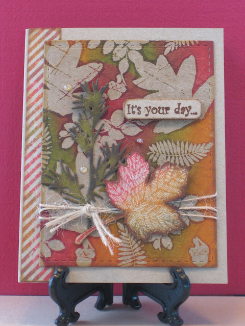
It's Your Day

Papertrey Ink Design Team Member Heather Nichols published a "Batik On Paper" technique recently and I had a lot of fun playing with the idea.  It basically involves clear-embossing solid images onto your cardstock, and then folding the heck out of it, coming in at all angles. 

This cracks the embossing and gets you ready for the next step . . .


Rubbing firmly, swirl on your choice of dye ink colors and make sure the inks get into all of the cracked embossing.  When done, use a paper towel to wipe off ink from the embossed surfaces.  You can quit now, or as I did, you can put the cardstock between two clean sheets of typing paper and iron off the embossing.  Batik is a hand-crafted look that I think goes well with plain un-embossed cardstock.  But I like a little glimmer, so I left a little of the sheen in place and even added some Wink of Stella and a few raindrops made with Glossy Accents.

Cardstock:   Marcos Jute
Stamps:        Just For Fun Hawthorne, A1 Stamps Rose Leaves, Peddler’s
                           Pack Acorn, Meer Image Small Compound Leaf, Clearly
                           Besotted Diagonal Stripes, Stampin’ Up Magnificent Maple,
                           Too Much Fun “It’s your day…”
Inks:               Distress Peeled Paint, Barn Door, Spiced Marmalade,
                           Brushed Corduroy, Wink of Stella Clear
Emb Powder:   VippiesTranscendence
Dies:              Lil Inker Stitched Mats Rectangles, Tim Holtz Holiday Greens
Impr Plate:    Papertrey Ink Linen
Doo Dads:    May Arts Jute, Glossy Accents drops 

Thursday, January 7, 2016

I Laughed

Our fellow stamp club member Barb is not only an excellent stamper, she's a passionate quilter as well!  She teaches quilting and enters her work annually in the NJ State Fair where she cleans up on prize winning ribbons every time.  So for her birthday card, I naturally had to pull out some of my quilting motif dies . . .


Quilters collect fabrics the way stampers collect cardstock, so I thought this sentiment would give us all a good laugh!  The inside message reads:  "May the fabric fairy always keep your stash filled."

Cardstock:   Bazzill Ocean, Pauley Poo, Strathmore Bright White,
                           The Paper Cut Eames White, various Blue scraps
                           from my Scrap Stash
Dies:              Spellbinders Classic Squares Small, Classic Scalloped
                           Squares Small,  Wplus9 Quilt Cuts 2, Papertrey Ink
                           Sketched Shapes, Wplus9 Banner Trio, Joy Buttons Set 1
Text:              All text was typed
Doo Dads:    White embroidery floss, Horizon/Tulip Hot Fix nail heads

Monday, January 4, 2016

Love

I had a specific design plan in mind when I began with this project, but it promptly croaked.  The original color scheme looked like a mistake instead of a plan, so – on to Plan #2.  This involved changing the colors to darker ones . . .


First, I laid down the Mosaic Heart stencil over the original colors, applied the stencil paste and then added the glitter.  When dry, I dusted off the excess and then sponged on some Chocolate Brown Gelatos.  I was delighted to find that the gleam and glitter still shone through.  Some of the original rusty color also shows which gives the glittery heart some warmth – a good thing, as this card is for an anniversary. 

Currently, I'm in the throes of an all-out glitter phase; bear with me while it runs its course.  Meanwhile, I'm having fun reflecting a whole lotta light . . .

Cardstock:   Bazzill Pinecone, Strathmore #90 Watercolor paper
Inks:               Gelatos Chocolate, Licorice, Black Cherry, Cinnamon,
                           Iced Chai
Emb Powder:   Sparkles Egyptian Gold, USArt Quest Effectz Gold Essence
Dies:              Impression Obsession Large Bow, Tim Holtz Alphanumeric
Stencil:          Simon Says Mosaic Heart
Doo Dads:    Dreamweaver Metallic Gold Embossing Paste